DAT401 SENIOR CAPSTONE PROJECT
Welcome to the blog of Maggie Skellie

WHAT THIS BLOG IS FOR!
Are you accidentally stumbling across this blog? Here's some context. January 10, 2024
Hello! This blog is for the Senior Capstone Project required of Design, Art, and Technology majors at Bellarmine University. The goal of this Creative Research/Resource Blog is to spend time searching out resources, works, and creative professionals that inspire and inform my project, while analyzing each resource in order to express what makes it successful and/or helpful. These resources will relate to my capstone’s theme!

THE INS & OUTS OF BRAND KTIS!
Learning About Brand Kits! January 17, 2024
For my project, I'm dabbling with the idea of creating brand kits for the company that I worked for. I worked for Belle Noble, which owns Le Moo, Grassa Gramma, and the Village Anchor. The founder of Belle Noble believes that the more random stylization of the company is more successful for his business plan, but this consequently makes the marketing department's job harder. I proposed with the head of marketing that I attempt to create more comprehensvive kits for our branding, which would make social media posting, signage, and other works made by us more cohesive and easier to produce. She was doubtful that the founder would be receptive to this idea. However, I believe that if I do enough research on the success and application of brand kits for the restaurant industry, that I may be able to make a real difference within my work with this project. I am currently attempting to find resources of successful and attractive brand kits and how to build your own!

VOCABULARY - Color
Vocabulary Related to Color and Design! January 24, 2024
COLOR
Additive Color - Adding colors to one another to get the color you are looking for. Each color introduction makes the color lighter rather than darker. (i.e. RGB, Red Green Blue, colors all together would come out to white.
Subtractive Color - Adding colors to one another to get the color you are looking for. Each color introduction makes the color darker rather than lighter. (i.e. CMYK, Cyan Magenta Yellow Black, colors all together would come out to black. K, black, is usually supplemental in professional printing. You can often achieve close to black by just mixing Cyan, Magenta, and Yellow.)
Complimentary Colors - Colors on opposite ends of the color wheel. (i.e. Red and Green, Purple and Yellow, Blue and Orange, etc.) These colors, although opposite, are often regarded as attractive when used together in design.
Analogous Colors - Colors right next to one another on the color wheel. (i.e. Red and Orange, Yellow and Green, Blue and Purple, etc.) These colors often work together in design due to their similarities to one another.
Triadic Colors - When an equilateral triangle is placed on the color wheel, these colors are paired together as triadic colors.
CMYK Color - Stands for Cyan, Magenta, Yellow, and Black. These colors are used in design and most often associated with professional print ink types.
RGB Color - Stands for Red, Green, Blue. These colors are used in design and most often associated with digital presentations, due to the colors of LEDs in most LCD screens.
Cool Colors / Warm Colors - Cool colors are blue, purple, and green. Warm colors are red, orange, and yellow. These colors are often paired together in design and art because of their similar connotations.
Hue - The value of a color that determines how it is perceived. More simply, a color or shade.
Saturation - The “brightness” of a color. For example, neon colors are very high in saturation. Pastel colors are low in saturation. And grey/white/black are all very low in saturation.
Luminance/Value - How our eyes perceive intensity of light. In art, value and luminance describe how shadows and lights fall on an object.
Grayscale - Colors with no saturation or hue, ranging from black to white.
Monochromatic - A scheme of colors that are all the same hue. Though they may change in value, this color scheme appears harmonious due to using the same color all over.
Tint - Any hue to which white is added/mixed in.
Tone - Any hue to which gray is added/mixed in.
Shade - Any hue to which black is added/mixed in.

RESEARCHING WHAT BELONGS IN BRAND KITS!
I Wasn't Sure What Went in Brand Kits When I Started! January 31, 2024
Source - "10 Brand Kit Examples Plus Tips and Tools" by Darya Jandossova Troncoso - Piktochart
The first research source I looked at for learning about brand kits was Piktochart’s “10 Brand Kit Examples Plus Tips and Tools.” In this source, they discuss the importance of visual identities, explaining that logo, font, and colors will help you stand out, and make your brand more recognizable.
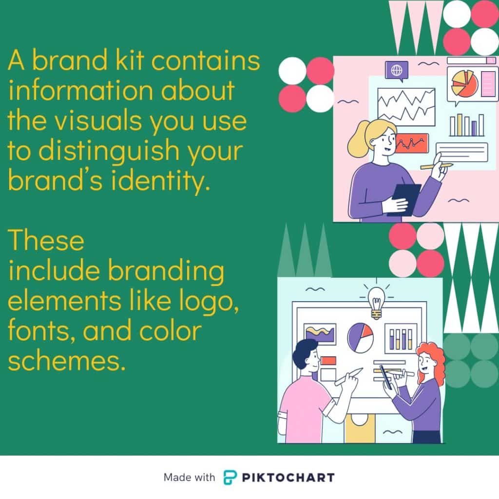
I would love to look more into the importance of consistency in branding, as it is touched on slightly in this source. The most important assets included in this article are the company logo, brand assets, color scheme/palette, imagery, typeface, typography, and contact information.
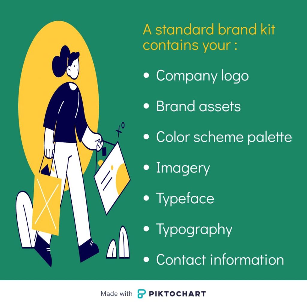
Templates for visual content also seem important to me, and I would like to explore this more for the package I intend to create in my project. According to this article, brand kits help keep visual identity and content consistency. Consistency will show an audience and clients that there is professionalism within a marketing department. It will also help you differentiate yourself from competitors with custom fonts and colors evoking the emotions and feelings you want the audience to associate with your brand voice. Again, this article touches on the importance of professionalism, messaging, and brand recognition.
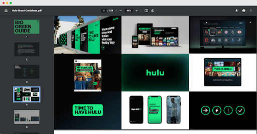
This article also shows examples of successful large brand kits, such as Hulu:
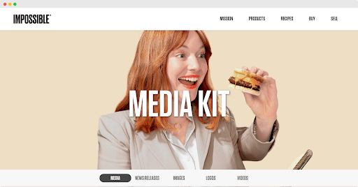
Impossible Foods:
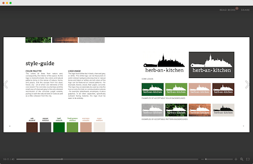
Herban Kitchen:
etc.
These brand kit examples provide comprehensive branding outlines for each company as listed publicly on their websites. These mainly include mission statements, logos, wordmarks, videos and images for marketing materials, contact information for PR requests, color palettes (with hex codes), and some brand kits that even match the company’s theming! For example, Yelp’s brand kit comes in the style of a cookbook.

VOCABULARY - Composition/Art
Vocabulary Related to Composition and Art! February 7, 2024
COMPOSITION / ART
1-Dimensional - A single dimension in space, like a line, ray, or dot. (X-Axis)
2-Dimensional - Two dimensions in space, includes shapes like circles, squares, rectangles, etc. (X, Y Axis)
3-Dimensional - Three dimensions in space, includes shapes like spheres, cubes, cones, etc. (X, Y, Z Axis)
4-Dimensional - A concept not perceivable by humans. Would include four dimensions in space. Some individuals have attempted to simulate a 4-D experience by implementing 3-D elements and senses like scent and touch.
Balance - Arranging both positive elements and negative space in such a way that no one area of the design overpowers other areas.
Focal Point - The areas of the artwork that demand the viewer's attention. Intelligent placement of focal points can positively affect the overall composition of the artwork.
Asymmetry - Asymmetrical balance results from unequal visual weight on each side of the composition. One side of the composition might contain a dominant element, which could be balanced by a couple or more lesser focal points on the other side.
Rule of Thirds - The rule of thirds is a composition guideline that places your subject in the left or right third of an image, leaving the other two thirds more open.
Chiaroscuro - Technique employed in the visual arts to represent light and shadow as they define three-dimensional objects.
Contrast - Contrast is the representation of two elements of design in opposite ways. For example, areas of bright light in comparison with areas of dark. The goal of contrast is to create strong focal points in an image.
Leading Lines - Lines that our eyes follow round a composition are called leading lines. They are a useful tool to create a visual flow or to emphasize focal points.
Motif - Represents the visual subject matter chosen for a composition, often driven by a motivating factor. Motifs in art encompass the integration of various visual elements like color, light, and shadow.
Negative Space - The space around and between objects. Instead of focusing on drawing the actual object, for a negative space drawing, the focus is on what's between the objects.
Unity/Harmony - The visually satisfying effect of combining similar or related elements. Harmony in a painting or design helps bring about unity.
Rhythm / Pattern - The movement within a piece of art that helps the eye travel through to a point of focus.

RESEARCH ON BRAND KIT IMPORTANCE
Digging Deeper into the Importance of Brand Kits February 14, 2024
Source - "What is a Brand Kit?" by Microsoft Create Team
For my second research source, I wanted to dig deeper into the importance of brand kits, as you can make one and propose it, but the individual you are selling it to will more than likely want an explanation behind the usage of the brand kit and its applications (at least in my case.) The Microsoft Create Team created the article I am referencing with importance placed on brand kits being an “essential piece of the puzzle” as well as a “toolbox” that holds all of your brand’s assets and logos so that you can easily access them and reproduce them, both within your marketing department and outside of your department when others need to access your brand’s identity for collaboration or commission.
The last source I referenced made a few lists of what belongs in brand kits, but this source goes more in-depth on the details of each asset belonging to a brand kit. For example, when discussing logos they state: “Your brand kit should contain multiple versions of your logo, if available. This might include your primary company logo, your secondary logo, logos with just brand initials, or logos that are used as icons. It’s a good idea to include multiple file types and sizes of your logos in your brand kit, so that the designer using them has flexibility. You should include both color and black and white versions of your logos as well.”
One of the most important parts of a brand kit includes fonts that match your brand’s visual identity. This article touches on this lightly, stating: “In your brand kit, be sure to include the font selections for your brand. Place the digital folder that contains your selected font family into your brand kit so that it’s easily downloadable for the team member that needs it. Does your brand use multiple fonts for different types of text? Make sure to include all of them in your brand kit.” However, I’d like to delve more into how to choose fonts for a brand kit in later research, as I have three separate, but similar restaurants to choose these for.

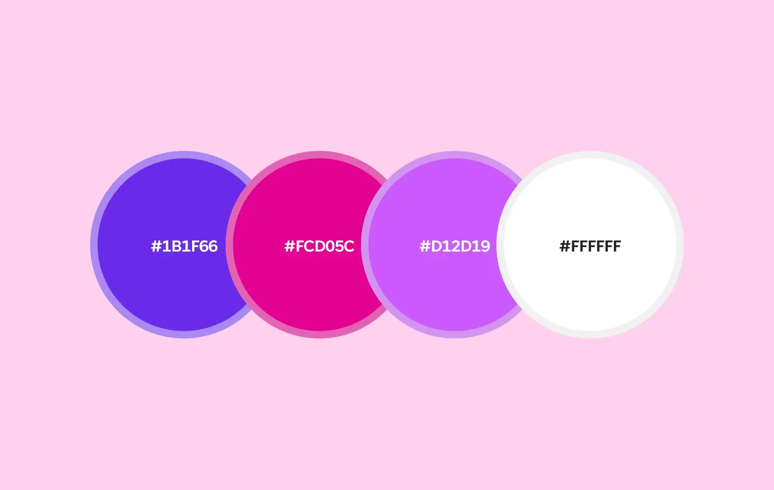
One of the most important parts of a brand kit is the colors and hex codes used. This article touches on how you should include these in a brand kit so that you don’t use colors differing from your brand’s visual identity. Microsoft gives an example, using a palette including a blue, pink, purple, and white color scheme:
This source also discusses templates and template sets, stating: “Include these branded templates in your brand kit so that your designer has an established starting point. Creating template sets to include in your brand kit can also be helpful—if you have a few ways to template an Instagram post, create an Instagram template set. These subsets can live under a larger social media template set. The more organized you can be with your templates and sets of templates, the easier it will be to reproduce your company’s visual identity.” If time constraints allow me, I’d like to work on making template sets for the company I am creating the brand kits for. I think it will make the visuals across social media more consistent, especially on platforms where all images can be seen side-by-side.
“A brand kit is the simplest way to ensure that your company’s visual communication stays consistent. With a brand kit, designers both internally and externally know where to access your brand’s graphic assets. Packaging these assets in one file makes sharing your brand identity a streamlined process that ultimately saves everyone on your design team from a headache!”

VOCABULARY - Digital Images & Graphic Design/Layout
Vocabulary Related to Digital Images and Graphic Design/Layout! February 21, 2024
DIGITAL IMAGES
DPI - “Dots Per Inch”: A measurement in printing, dots printed on paper. Used to describe the resolution number of dots per inch in a digital print.
Image Resolution - The level of detail contained in an image, specifically the number of pixels that exist in an image.
Pixel - Dots or squares that make up an image on a digital screen/computer screen.
PPI - “Pixels Per Inch”: A measurement in digital images. Used to describe the resolution number of square pixels per inch in a digital image.
Raster Images - Images compiled using pixels. Because these images are pixel-based, they are resolution-dependent.
Vector Images - Images created using mathematical formulas to represent the image, rather than a grid of pixels. Can be scaled to any size without losing quality.
GRAPHIC DESIGN/LAYOUT
Above the Fold - Any part of a webpage shown before scrolling. The “fold” is where the browser window ends.
Branding / Brand Identity - The visible elements of a brand, such as color, design, and logo, that identify and distinguish the brand in consumers’ minds.
Style Guide - A set of standards for the writing, formatting, and design of documents, either for general use or for a specific publication, organization, or field.
Logo - A symbol or other design adopted by an organization to identify its products, uniforms, vehicles, etc.
Lorem ipsum - Placeholder text commonly used to demonstrate the visual form of a document or a typeface without relying on meaningful content.
Trapped White Space - Small areas of negative space surrounded by other elements and not easily accessible for design or layout purposes.
White Space - The space between text, graphics, images, and blocks.
En vs. Em Dash - The en dash is approximately the length of the letter N, and the em dash is the length of the letter M. The shorter en dash (–) is used to mark ranges and with the meaning “to” in phrases like “Dover–Calais crossing.” The longer em dash (—) is used to separate extra information or mark a break in a sentence.

RESTAURANT-SPECIFIC BRANDING
Research into branding that would relate specifically to restaurants! March 6, 2024
Source - "How to Brand a Restaurant: Restaurant Branding Ideas and Examples" by Allie Van Duyne - Toast
For this research post, I wanted to look more into restaurant-specific branding, as many of the sources I have looked at seem to be for brands that sell goods or services. Because my project revolves around the branding of three restaurants, I found it important to look more into how one would brand a restaurant successfully. Toast is a company that sells point-of-sale systems, and deals with mainly restaurant businesses, so I trusted their source on this subject.
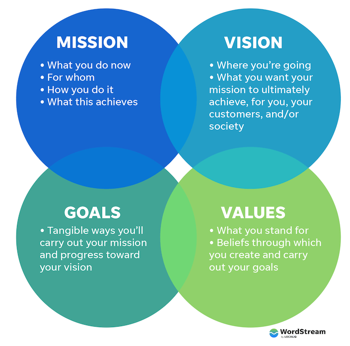
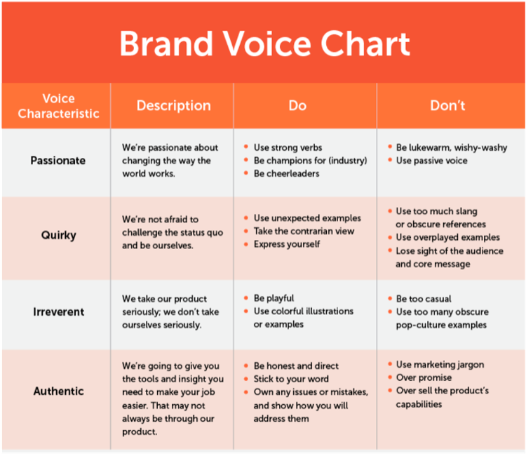
This article places a strong emphasis on developing a mission statement for the restaurant you are branding for. Because I am building branding around an existing restaurant, I will have to find what makes each restaurant unique, as well as what experience each location intends to give its customers. The important questions this source provides for an individual to ask are: “How does your restaurant serve them, and why are you serving them? Why are you choosing to serve this type of food in this style? What is your promise to your customers, and why should they care?” Your goals, and how they’ll affect your customers, are also typically included in mission statements. “Who are you? What are you doing? Why are you doing it? What are you hoping to accomplish? and How are you going to accomplish it?”
Another point of emphasis is the brand voice of a company. How you will speak, act, interact, and communicate with prospective, new, and existing customers. This begins with finding adjectives to align with your brand based on the food, decor, or energy of the people you hope to attract.
This article also advises creating mood boards of logos, colors, restaurant designs, and other aesthetic elements.
Overall, I’d like to implement much of the advice this article offers, and this will help me implement and discover designs that will align with the restaurants I am creating brand kits for.

VOCABULARY - Theory & Logotypes
Vocabulary Related to Theory & Logotypes! March 13, 2024
THEORY
Modernism - Modernism emerged in the late 19th and early 20th centuries, roughly from the 1890s to the 1940s. It was a response to the rapid social, political, and technological changes of the time, such as industrialization and urbanization. Modernist art and literature favored abstraction, minimalism, and formal experimentation. It aimed for originality and innovation, often breaking away from traditional conventions.
Postmodernism - Postmodernism began to take shape in the mid-20th century, around the 1950s, and continued into the late 20th century. It was a reaction to the perceived failures and limitations of modernism, particularly in addressing social and cultural complexities. Postmodern art and literature frequently incorporated pastiche, parody, and irony. It borrowed from various styles and sources, mixing high and low culture, and challenging the notion of originality.
LOGOTYPES
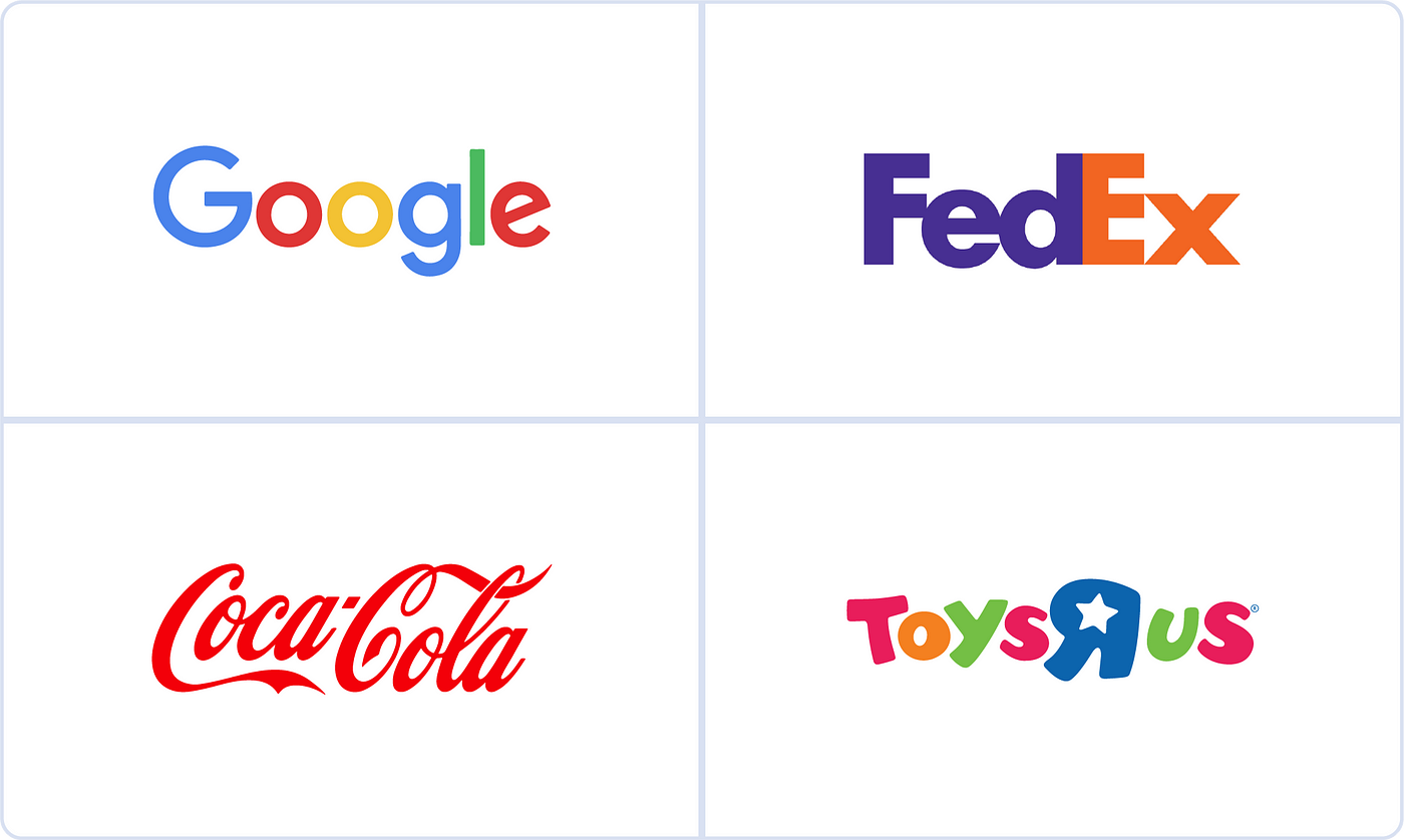
Abstract Mark - An abstract mark is a specific type of pictorial logo. Instead of being a recognizable image—like an apple or a bird—it's an abstract geometric form that represents your business.
EXAMPLE:

Emblem - An emblem is a logo type that features text, a symbol, or imagery inside a geometric shape.
EXAMPLE:
Lettermark - A lettermark is a typography-based logo that's comprised of a few letters, usually a company's initials.
EXAMPLE:
Pictorial Mark or Symbol - Pictorial/Symbol logos are made up of graphics that visually represent the brand name or function. These can be icons, illustrations, or shape compositions that are instantly recognizable as something specific.
EXAMPLE:
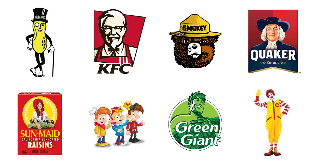
Mascot - A mascot logo is a type of logo design that incorporates an illustrated character, often an animal, person, or object, to represent a brand, team, or organization. This character, known as the mascot, becomes the visual embodiment of the entity it represents.
EXAMPLE:
Wordmark - A wordmark logo is a font-based logo that focuses on a business' name alone.
EXAMPLE:

RESEARCHING OTHER RESTAURANTS' SOCIAL MEDIA
the Meatball Shop and Steak 'n Shake have good examples of Restaurant Instagram layouts! March 20, 2024
Sources - "the Meatball Shop" on Instagram
"Steak 'n Shake" on Instagram
The Meatball Shop is a restaurant in Hell’s Kitchen, NY. Their social media branding is simplistic, yet cohesive and effective. It consists mainly of photography of their dishes, but the cohesion of said photography comes mainly from the backgrounds and quality of photography that they use across all images. Even their website uses a similar simplistic branding consisting mainly of food photography, a neutral color palette and modern fonts. I notice this type of branding across many restaurants’ social media pages, as the focus is drawn to the food rather than the colors and design choices.
Steak & Shake has a similar layout to many restaurants’ social media that I’ve seen where they showcase images of their menu items. However, Steak & Shake has a unique marketing strategy, wherein their restaurant is more historical than others, and they can add in posts of old images of their restaurants, building ethos in the mind of consumers, and making their perception of this chain restaurant more reputable due to their time of experience. When Steak & Shake does include typography and other design elements in their posts, they do so minimally with a script and sans serif font face, making the food images still the main focus.

VOCABULARY - Printing and Print Materials
Vocabulary Related to Printing and Print Materials! March 27, 2024
PRINTING AND PRINT MATERIALS
4-Color / Process Color - Four ink colors (cyan, magenta, yellow, and black / CMYK) printed as millions of tiny, overlapping dots that blend together to create the full color spectrum.
Pantone / Spot Colors - Solid colors created using a specific premixed ink, usually based on Pantone Matching System (PMS) colors. Pantone colors are standardized, and each one is assigned an individual number and name, which designers and printers in different locations can use to easily identify the same exact color.
Bleed - Refers to printing that extends off the edge(s) of a printed piece. Any printed elements that bleed must extend 0.125” beyond the trimmed edge of the piece.
Trim - The edge of the page, where the piece will be cut or “trimmed.” This is also the final size of the piece.
Hard Proof - A physical sample of the print used for more complex printing projects, such as fine art prints or photography.
Soft Proof - An electronic sample of a work, usually a PDF, which can be viewed on a computer monitor or electronic device. A quick and economical way of verifying print quality.
Inkjet printing - A type of computer printing that recreates a digital image by propelling droplets of ink onto paper and plastic substrates.
Web Press - A press that prints a continuous roll of paper. Typically used to produce magazines and newspapers.
Letterpress - A form of relief printing where the text or image is on a raised surface, like a rubber stamp. Ink is applied to the raised surface and then paper is pressed directly against it to transfer the text/image.
Substrate - The base material, such as plastic film, glass, paper, or other textiles such as canvas onto which an image is printed.

THE CHALLENGES & BENEFITS OF BRAND CONSISTENCY
An Important Part of my Project - Brand Kit Importance! April 3, 2024
Source - “The Challenges and Benefits of Brand Consistency” by Brianna Martin - Mighty Citizen
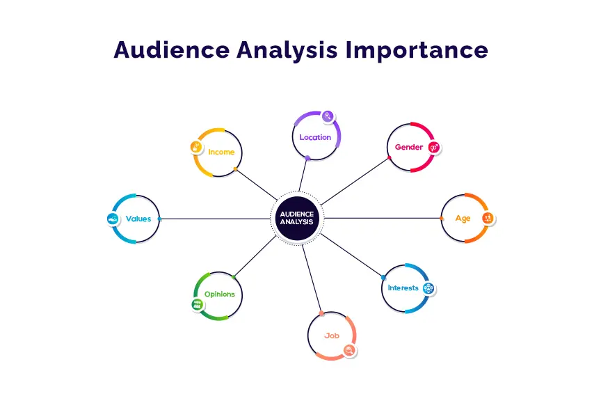
Mighty Citizen breaks the challenges of brand consistency down into three major categories. Complex organizational structures, decentralized decisions, and misunderstanding your audiences. The first applies to multiple audiences and departments making imagery and tone of a brand kit more difficult, as many different ideas make the formulation a convoluted process. The second applies to each department having different goals and orders, making the brand identity disjointed. The third applies to not knowing the demographic of your audiences and not branding according to who you’d like to attract, or the audience you’ve already built.
Mighty Citizen then breaks down the benefits of brand consistency into three major points. Building trust, making you learnable, and working more efficiently. On the basis of building trust, Mighty Citizen had this to say: “Consistency suggests professionalism and organization. It tells your audiences that you’ve spent the time, resources, and intellectual capital required to deliver a compelling message to the world. If your audience doesn’t trust your brand, they will not engage with it long term—no matter how enticing your incentives.” When discussing brand consistency making you learnable, Mighty Citizen stresses cognitive strain. Cognitive strain occurs when a user views your branding and has to use too much mental power to decipher your message. Brand consistency allows your audience to feel your brand more than think about it. “Brand consistency is important for making your audience understand you. Inconsistent messages increase cognitive strain, which is a needless roadblock.”

Mighty Citizen also stresses the importance of efficiency in the workplace with brand consistency. With a more consistent brand kit, you are able to accomplish more internally as fast as possible. “You want to make the process of engaging with your organization as resource-light as possible.”

VOCABULARY - Typography and Text Design
Vocabulary Related to Typography and Text Design! April 10, 2024
TYPOGRAPHY AND TEXT DESIGN
Drop Cap - A large capital letter used as a decorative element at the beginning of a paragraph or section.
Font family vs. Typeface - A font family is a group of related fonts. Font refers to the variation in weight and size of a typeface. A typeface is a set of design features for letters and other characters.
Kerning - The spacing between individual letters or characters.
Monospace - A font whose letters and characters each occupy the same amount of horizontal space.
Tracking - The spacing between glyphs applied to an entire piece of text.
Leading / Line Height - The vertical distance between two lines of text, measured from the baseline.
Justified Text - Space added between words so that both edges of each line are aligned with both margins.
Orphans - A single word that sits at the bottom of a paragraph of text.
Widows - The end of a paragraph that appears at the top of a column.
Points - Smallest unit of measuring font size, leading, and other items.
Picas - Unit of measure, approximately ⅙ of an inch and contains 12 points.
Serif / Sans Serif - Serif typefaces are recognized by the tiny lines or “feet” that extend off the letters. “Sans” is Latin for “without,” and Sans Serif typefaces do not feature these small lines.
Slab Serif - A group of typefaces close to sans serifs in their construction, including their generally low stroke contrast, but possessing serifs that match the overall stroke.
Display Font - A typeface designed to be used in small quantities at large sizes. Such as titles, headings, logos, etc.
Small Caps - Used in running text as a form of emphasis that is less dominant than all uppercase text, and as a method of emphasis or distinctiveness for text alongside or instead of italics, or when boldface is inappropriate.

CHOOSING FONTS FOR BRAND KITS
Researching how to best choose fonts for Brand Kitting! April 17, 2024
Source - “The Ultimate Guide to Choosing Your Brand Fonts” by Raja Mandal - Visme
“According to MDG Advertising, 75% of consumers judge a business by its website design, and 72% say packaging design influences their buying decisions. Since fonts play a key role in website and packaging design, choosing the perfect font can be hugely beneficial for any brand.”

Visme defines Serif fonts as the most traditional typeface, symbolizing class and heritage. “If you're looking to create a formal brand personality, serif fonts are ideal for you. They help you demonstrate trustworthiness while building brand awareness. Brands like Rolex, Tiffany & Co., Prada, Gucci, Vogue and many others use serif fonts in their branding”

Visme defines Sans-Serif fonts as sleek, minimal, and modern. They are most often used to communicate simplicity and straight-forwardness. “If you want to convey simplicity and modernity in your brand name, choose sans serif. Popular brands like Microsoft, Panasonic, Kawasaki, Jeep, LinkedIn, Calvin Klein and Google use sans serif fonts in their branding.”

Visme defines Slab Serif fonts as bold and solid, conveying confidence, creativity, and dependability. They suggest using these for headers and titles, because while they are extended fonts, they are easier on the eyes when used in this way. “Choose slab font if you want to make a big splash or indicate how innovative your products and ideas are. They can help you communicate a sense of importance and need. Thus, brands like Honda, Volvo, Sony and many others.”
This page also discusses script, handwritten, and decorative fonts. Script is defined as fancy, elegant, and feminine. Handwritten is defined as personable, authentic, and playful. Decorative is defined as creative and unique.

VOCABULARY - Parts of Type
Vocabulary Related to Parts of Type! April 24, 2024
PARTS OF TYPE
Apex - The pointed end of a character that extends above the height of the other characters in a font, such as the top of a lowercase “d” or “h”. Sometimes referred to as the “top” or “vertex” of a character.
Arm - The horizontal stroke extending from a stem or main stroke of a letterform, typically in letters such as “T,” “F,” and “E.” The arm adds to the visual balance of the letter.
Ascender - An upward part of a letterform (often a vertical stroke) that extends above the x-height and usually above the cap height, such as the stem of a lowercase “b” or “d.”
Baseline - The invisible line on which letters rest.
Bowl - The rounded, enclosed part of certain letters, such as “a,” “B/b,” “d,” “o,” “o,” and “q.”
Cap height - The height of a typeface’s uppercase letters, measured from the baseline to the top of flat-topped glyphs.
Counter - Area of a letter that is entirely or partially enclosed by a letter form or a symbol, such as “o,” “d,” “c,” and “u.”
Crossbar - A bar that crosses between two other strokes, like in the capital “A” and “H” and the small “e.”
Descender - The portion of a letter that extends below the baseline of a font, such as “j,” “p,” and “q.”
Ear - The small stroke that projects from the top of a lowercase “g” in certain typefaces.
Finial - A tapered or curved end, seen on “e” and “c.”
Ligature - Occurs where two or more graphemes or letter are joined to form a single glyph. (i.e. æ, œ)
Serif - Small lines attached to letters. Also known as “feet.”
Spine - The main curved stroke of a lowercase or capital “S/s.”
Stem - The main, usually vertical stroke of a letterform.
Terminal - The ending of the stroke on a glyph. A key factor in overall typeface design. Affects legibility as well as stylistic expression.
x-height - Distance between the baseline and the mean line of lowercase letters in a typeface.
JUMP TO POST
-
What This Blog is For!
January 10, 2024 -
The Ins & Outs of Brand Kits!
January 17, 2024 -
VOCABULARY - Color
January 24, 2024 -
Researching What Belongs in Brand Kits!
January 31, 2024 -
VOCABULARY - Composition/Art
February 7, 2024 -
Research on Brand Kit Importance
February 14, 2024 -
VOCABULARY - Digital Images & Graphic Design/Layout
February 21, 2024 -
Restaurant-Specific Branding
March 6, 2024 -
VOCABULARY - Theory & Logotypes
March 13, 2024 -
Researching Other Restaurants' Social Media
March 20, 2024 -
VOCABULARY - Printing and Print Materials
March 27, 2024 -
The Challenges & Benefits of Brand Consistency
April 3, 2024 -
VOCABULARY - Typography and Text Design
April 10, 2024 -
Choosing Fonts for Brand Kits
April 17, 2024 -
VOCABULARY - Parts of Type
April 24, 2024
Maggie Skellie (She/They)
Hello! I am Maggie Skellie. I am a student at Bellarmine University where I major in Communications and Design, Arts, & Technology. I am also the president of BUKnighted at Bellarmine University, the LGBTQIA+ and Ally organization on campus. This semester, I worked as the Digital Media Intern for Belle Noble Entertainment Group, which owns the Village Anchor, Grassa Gramma, and Le Moo. I am most impassioned by art of any form, whether it be digital art, traditional art, graphic design, photography, and so much more. You can see a full portfolio of my accomplishments and passions here.